This Unusual Café In Seoul Will Make You Feel Like You Walked Into A Cartoon

laporcupina:

archatlas:

image

From the moment you cross the café’s doorstep, you are greeted by comic strips plastered all over the interior, from walls and floors to the furniture and dishes, so you can’t help but feel as if you magically found a secret entrance to the unreal comic world. 

Keep reading

It’s the A-ha video come to life

This Unusual Café In Seoul Will Make You Feel Like You Walked Into A Cartoon

accessibilityfails:

i-need-that-seat:

pseudosoph:

i-need-that-seat:

For structures that have no entry steps, ConvertaStep also makes ramps of three sizes that come in a manual as well as automatic version.

(via ConvertaStep | Wheelchair Accessibility | Ramps | Convertastep – Freedom In Mobility)

This welcome mat converts into a fully accessible wheelchair ramp. Beautiful and functional design. I want it.

Some more info, for people who are interested.

First of all, I can’t believe this has almost 3,000 notes. I’m so glad that people are sharing this – both as a cool design, and also as an important accessibility feature.

Thanks to pseudosoph for linking to additional info (above) regarding weight limits, lift height, and product background – the creator is a wheelchair user himself! Very cool stuff. Keep sharing!

This isn’t a fail. Just wanted to share an accessibility win so people can get ideas for improving accessibility

assemble-the-fangirls:

nonelvis:

kleinsaur:

decodering:

Dos and don’ts on designing for accessibility

Karwai Pun, GOV.UK:

The dos and don’ts of designing for accessibility are general guidelines, best design practices for making services accessible in government. Currently, there are six different posters in the series that cater to users from these areas: low vision, D/deaf and hard of hearing, dyslexia, motor disabilities, users on the autistic spectrum and users of screen readers.

[…] Another aim of the posters is that they’re meant to be general guidance as opposed to being overly prescriptive. Using bright contrast was advised for some (such as those with low vision) although some users on the autistic spectrum would prefer differently. Where advice seems contradictory, it’s always worth testing your designs with users to find the right balance, making compromises that best suit the users’ needs.

[github]

I’ve been wanting something like this to reference! Boosting for the others that like to dabble in code/design.

This is some of the most lucidly written accessibility advice I’ve seen. Making accessible web pages should be the default, not an add-on. It’s really not that hard to do, especially when you think about it from the start – and it benefits everyone.

(Obligatory note that there are exceptions to some of these guidelines, e.g., “bunching” some interactions together is an important way to cue which interactions are related to each other, but that’s why these are guidelines, not absolute rules.)

young web designer: thank you oh my god no one has been able to explain this quite as well and this is just good shit

This advice also makes websites easy to use for neurotypical people and kids, so generally it’s just good design.

If You’re Gonna Make Something Wheelchair Accessible, Don’t Make it a Thing

etherealastraea:

literaryfurball:

urbancripple:

Here’s some examples awkward accessibility being a thing:

Your at a hotel that has a lift to get you from one sub-floor to another, but the lift can only be unlocked and operated by one specific person that the hotel now has to go find. Sure, they’ve made the entrance to the sub-floor is accessible, but now it’s a thing.

The buses are wheelchair accessible but the driver has to stop the bus, take 30 seconds to lower the goddamn ramp, move passengers out of their seats, hook up the straps and then secure you in the bus. Sure, they’ve made the busses accessible but now it’s a thing.

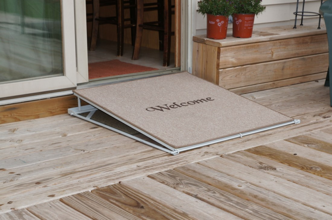
The restaurant has an accessible entrance, but it’s past the trash room and through the kitchen. Sure, the restaurant is accessible, but now it’s an insulting thing.

Here’s some great examples of accessibility not being a thing:

The train to the airport pulls up flush with the platform. I board with everyone else and sit wherever the fuck I want. Riding the train is accessible and not a thing.

In Portland, I press a button the side of the streetcar and a ramp automatically extends at the same time the door opens. I board in the same amount of time as everyone else. This is not a thing.

I get that it is difficult to design for wheelchair accessibility, but folks need to start considering the overall quality of the experience versus just thinking about meeting the minimum requirements.

For the love of all things holy please pay attention to this

This is why universal design is so important. I had a great class that focuses on applying universal design aspects of architecture into teaching. Accessibility ideally should be integral to the design in the first place, not added on as an after thought.

jihoa:

Cursum | Baby Stroller by Sjöblom

‘Believe it or not, there are still large portions of the population that are surprised that people with disabilities have babies. They may even be surprised that wheelchair users who have babies want to go on walks or run errands with their babies with them.’

A design made in conversation with wheelchair users, really intuitive. The stroller can be lifted over curbs and stand alone when needed.